Your Custom Text Here
Atlanta Science Festival


Atlanta Science Festival
Role: Creative Director (Lenz Marketing)
Client: Atlanta Science Festival
Bringing Science to the Masses
Design is at its best when it helps bring people together, communicate important ideas, and create lasting memories. I had the incredible opportunity to collaborate with the Atlanta Science Festival, a week-long celebration that brings science to the forefront for thousands of attendees every year. From developing a beloved festival mascot to crafting a cohesive visual experience for the entire event, this project was a journey of creativity, problem-solving, and meaningful storytelling.
Crafting a Mascot to Inspire Wonder
One of the standout aspects of my work with the Atlanta Science Festival was creating the festival mascot. The goal was to design a character that not only represented the essence of science but also engaged audiences of all ages, making the subject approachable, fun, and exciting. Through multiple iterations and a collaborative design process, we developed a mascot that became a recognizable symbol of the festival—sparking curiosity and joy in the hearts of festival-goers.
The mascot appeared everywhere, from promotional materials and social media to physical installations at the event, creating a consistent, engaging identity for the festival.
Advertising and Promotion: Building Buzz
With a client as dynamic as the Atlanta Science Festival, the challenge was to create promotional materials that conveyed the energy and excitement of the event while maintaining a clear focus on the diverse science themes presented. I designed a wide range of assets, including posters, digital ads, banners, and more, all designed to generate buzz and capture the imagination of a broad audience—from families with children to adults passionate about science.
Visual Consistency Across Platforms
One of the critical aspects of the promotional work was ensuring that the festival’s visual identity was cohesive across multiple platforms. I collaborated closely with the client to develop a color palette and typography system that was vibrant, modern, and reflective of the festival’s innovative spirit. These visuals were used across social media campaigns, email newsletters, and other promotional efforts to build excitement leading up to the event.
Signage and Wayfinding: Designing a Seamless Experience
Design doesn’t end with digital or print materials; it extends to the physical environment of the event itself. For the Atlanta Science Festival, I designed signage and wayfinding that guided attendees through the festival’s numerous venues and event spaces. Clear, visually engaging wayfinding was critical, especially given the wide variety of activities, from outdoor experiments to lectures in various parts of the city.
The signage not only helped attendees navigate easily but also contributed to the overall aesthetic of the festival, reinforcing its identity through consistent design elements.
A 40+ Page Booklet for Over 100 Events
The sheer scale of the Atlanta Science Festival meant that one of the key deliverables was a 40+ page booklet detailing the 100+ events happening throughout the week. I took on the challenge of designing this extensive program, ensuring that the layout was both informative and easy to navigate.
The booklet was designed with clear sections, intuitive navigation, and plenty of visual interest to maintain reader engagement. It featured event descriptions, schedules, maps, and highlights, all while staying true to the festival’s playful and engaging visual identity.
Social Media and Content Support
In today’s world, no event is complete without a strong social media presence. I worked alongside the Atlanta Science Festival team to support their social media and content strategy, creating visuals for social platforms that were consistent with the festival’s branding and messaging. Whether it was teaser posts leading up to the event or live content during the festival, the goal was to maintain engagement and excitement across digital channels.
The Result: A Festival That Resonates
Working with the Atlanta Science Festival was an incredible experience. Through the development of a strong, cohesive visual identity—from the mascot to promotional materials, signage, and content support—we were able to create an environment that made science fun, accessible, and exciting for people of all ages. The success of the festival speaks to the power of thoughtful design in making complex subjects like science resonate with a broad audience.
This project highlights my passion for combining creativity with strategy to deliver impactful, user-centered design solutions. Whether developing a mascot or creating a 40+ page booklet, every aspect of the Atlanta Science Festival was a testament to the power of design in enhancing experiences and bringing ideas to life.
Blue Cross Blue Shield FEPBlue App

FEPBlue & MyBlue: Accessibility, Scalability, and Cross-Platform Design Excellence
Role: Director of UX/UI (MERGE)
Client: Blue Cross Blue Shield – Federal Employee Program (FEP)
Platforms: iOS, Android, Web
Scope: Full redesign to meet WCAG 2.1 AA compliance, creation of a scalable design system, modernization of design-to-development workflows
Strategic Challenge
The FEPBlue app serves millions of federal employees managing their health benefits. While mission-critical, the app faced two major issues:
Accessibility gaps that created compliance risk and hindered usability for members with disabilities.
Process and tooling inefficiencies between design and development, leading to inconsistencies, rework, and slower release cycles.
As design lead, my challenge was to deliver a fully accessible redesign while also modernizing the way design and development teams collaborated to ensure long-term scalability and consistency.
My Role & Leadership
Set an accessibility-first vision for the redesign, positioning WCAG 2.1 AA compliance as both a compliance requirement and a brand differentiator.
Led cross-functional adoption of Storybook, creating a 1:1 relationship between our Figma design system and coded components.
Introduced atomic design methodology to both design and code libraries for improved scalability, onboarding, and collaboration.
Partnered with development to modernize coding practices and ensure accessibility was embedded at the component level.
Key Initiatives & Outcomes
1. Storybook Adoption & Alignment with Figma
Evaluated and implemented Storybook as the shared platform for component documentation and development.
Created a direct 1:1 mapping between Figma components and Storybook code to eliminate design-to-code discrepancies.
Gained developer and stakeholder buy-in through a presentation outlining best practices and tangible benefits, including reduced QA cycles and faster feature releases.
Impact:
Reduced design-to-dev QA cycles by 30%.
Decreased new feature/component release times by 25%.
Significantly fewer inconsistencies between design and code at launch.
2. Atomic Structure for Scalability
Implemented the atomic hierarchy (atoms, molecules, organisms, templates) across both design and development workflows.
Used templates to streamline the design → dev → testing pipeline, ensuring all teams worked in a consistent, modular fashion.
Impact:
Simplified onboarding for new team members.
Improved collaboration between design, dev, and QA teams.
Reduced the time needed for feature iteration and testing.
3. Modernizing Development Practices
Discovered that while the dev team claimed to be working component-based, their process wasn’t aligned to best practices.
Guided the shift to true component-based architecture across iOS, Android, and Web.
Embedded accessibility requirements directly into Storybook components, reducing bugs and improving quality.
Impact:
Fewer accessibility-related bugs flagged in QA.
Increased user trust due to consistent, accessible interactions.
More efficient regression testing process.
Business & User Outcomes
Full WCAG 2.1 AA compliance across all platforms.
Enhanced member satisfaction through improved navigation, readability, and usability.
Strengthened brand trust by delivering an inclusive experience for all members.
Established a repeatable, scalable design-to-development framework that accelerates future initiatives.
Conclusion
The FEPBlue redesign wasn’t just a visual update — it was a transformation of the entire design and development ecosystem. By embedding accessibility into both the product and the process, we delivered a better experience for millions of members while future-proofing the platform for scalable growth.
Amplify Music Festival


Amplify Music Festival — Identity & Branding • Environmental Design • Advertising
Role: Creative Director (Lenz Marketing)
Client: Amplify Music Festival
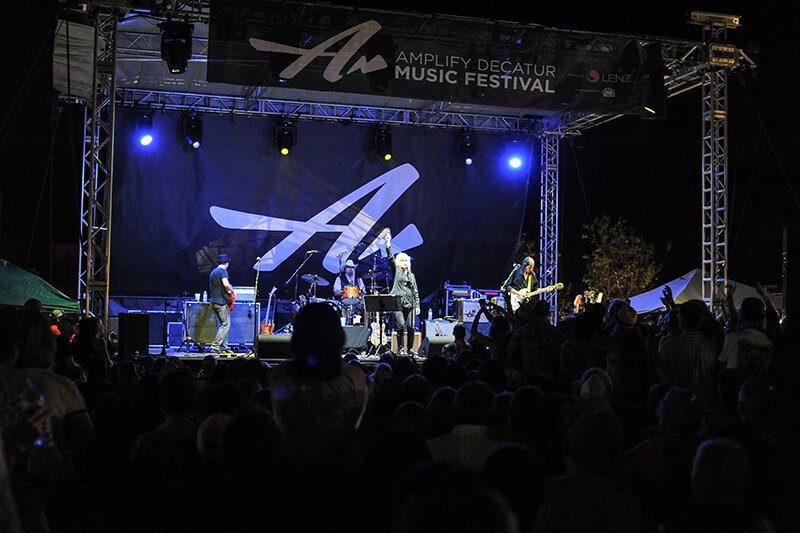
Amplify is a non-profit organization that harnesses the power of music and community to raise funds for local causes in the metro Atlanta area. Its flagship event, a three-day music festival, takes place across multiple venues in Decatur, GA—including an open-air stage on the city’s square—and has grown into a beloved tradition for both residents and visitors.
To capture the spirit of the event and its mission, we developed a dynamic identity system, poster art, website, digital and traditional advertising, and environmental graphics. The brand identity was designed to reflect both the meaning behind the organization’s name—amplifying the impact of local nonprofits—and the energy of the live music performances themselves. Each year, the festival’s visual language evolves, with new poster art that not only celebrates the featured musical talent but also serves as the foundation for the broader advertising campaign, website design, and on-site graphics.
Environmental design played a crucial role in creating a cohesive experience for attendees. Signage, stage banners, and venue graphics were designed to reinforce the brand identity, guide festival-goers between locations, and bring a sense of vibrancy to the entire event footprint.
The results speak for themselves: attendance, performance slots, and participating venues have grown year over year. Since its inception in 2011, Amplify has raised more than $575,000 for community-based nonprofits, directly benefiting organizations that make a tangible difference in the lives of local residents.
American Oncology Network

American Oncology Network — Responsive Web Redesign
Role: Creative Director Lenz Marketing)
Client: American Oncology Network (AON)
Platform: Responsive Web
Scope: Website redesign, audience strategy, UX/UI design, responsive implementation
The Challenge
American Oncology Network is a nationwide alliance supporting community oncology practices across the United States. Their website needed to serve two core audiences with very different needs:
Physicians and practice leaders evaluating partnership opportunities and professional resources
Patients and families seeking care information, trust, and support
The existing experience did not clearly distinguish between those audiences, creating friction in navigation and making it harder for users to quickly find relevant content.
The opportunity was to create a more intuitive, modern digital experience that clarified pathways, strengthened the brand, and performed seamlessly across devices.
My Role
I led the redesign effort from strategy through execution, translating business goals and audience needs into a clearer digital experience.
Key contributions included:
Defining audience needs and content priorities
Structuring user flows for physicians and patients
Leading visual design direction and responsive layouts
Partnering with developers to bring the experience to life across breakpoints
Ensuring consistency with the broader brand and marketing ecosystem
The Solution
1. Audience-Focused Information Architecture
Reorganized site structure and navigation to better support the priorities of each audience group.
Clearer entry points for physicians and patients
More relevant content surfaced earlier in the journey
Reduced friction in key navigation paths
Result: A more intuitive experience tailored to user intent.
2. Responsive Experience Across Devices
Designed a fully responsive website optimized for desktop, laptop, tablet, and mobile.
Flexible layouts across screen sizes
Improved readability and usability
Consistent experience regardless of device
Result: Better accessibility and engagement for users wherever they accessed the site.
3. Modernized Brand Expression
Refreshed the visual experience to better reflect AON’s professionalism, credibility, and patient-centered mission.
Stronger visual hierarchy
Cleaner presentation of complex information
More polished and trustworthy digital presence
Result: A digital experience aligned with the organization’s scale and reputation.
Conclusion
By differentiating user journeys for oncologists and patients, the new AON website delivered clarity, speed, and trust for two distinct audiences. The responsive redesign not only elevated the brand experience but also supported AON’s rapid growth and national expansion.
FedEx | ShopRunner


ShopRunner (FedEx) — Scaling a Unified Design System Across B2C & B2B Platforms
Role: Director of UX/UI (Bottle Rocket)
Client: FedEx – ShopRunner
Platforms: Desktop, Mobile Web, iOS, Android, Merchant Dashboard (B2B)
Scope: Cross-platform product expansion, design system creation, and governance
Strategic Challenge
ShopRunner — an Amazon Prime–style membership program acquired by FedEx in 2020 — offers free two-day shipping, free returns, and member-only discounts through its network of retail partners.
The company had an existing desktop and mobile web presence but wanted to:
Expand into native iOS and Android apps for consumers.
Develop a merchant-facing dashboard (B2B) for managing sales, returns, and customer engagement.
To maintain brand and experience consistency across multiple teams and platforms, we needed a scalable design system that could align diverse product groups while supporting rapid development.
My Role & Leadership
Partnered with product leads across consumer and merchant experiences to identify shared needs and technical constraints.
Directed the creation of “Bolt”, a cross-platform design system that provided both a visual identity framework and reusable coded components.
Established governance processes to manage component creation, version control, and cross-team adoption.
Led design-development alignment by ensuring a 1:1 relationship between the Figma design library and Storybook code library.
Key Initiatives & Outcomes
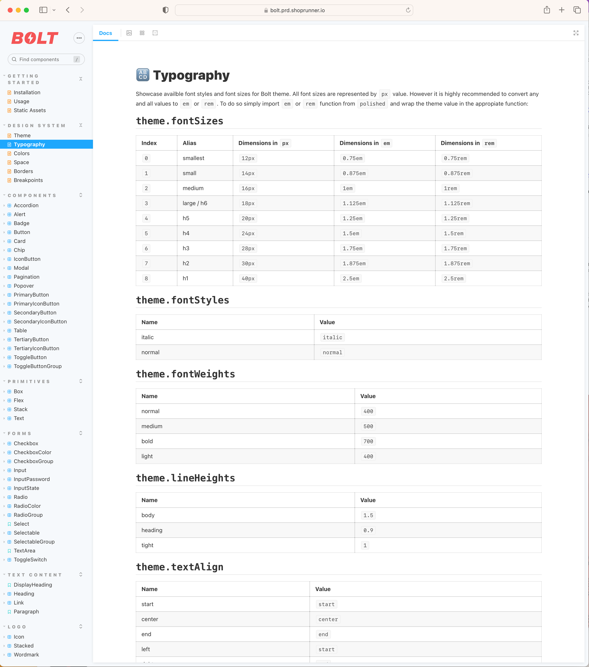
1. Bolt Design System Development
Created a comprehensive Figma library covering typography, color, iconography, spacing, and responsive component patterns.
Partnered with development to build a matching Storybook code library, ensuring visual and functional parity across all products.
Standardized UI patterns to streamline workflows and reduce redundant design effort.
Impact:
Enabled product teams to design and build faster, with fewer inconsistencies.
Reduced QA feedback cycles by ensuring components were vetted in both design and code before release.
2. Cross-Team Alignment & Governance
Brought together B2C and B2B product teams in recurring governance meetings to review, approve, and prioritize new components.
Created shared documentation and usage guidelines to support onboarding and future expansion.
Impact:
Improved transparency between product teams, eliminating duplicate work.
Increased cross-platform consistency, strengthening the ShopRunner brand experience.
3. Product Launches Powered by Bolt
Launched updated desktop and mobile web experiences with modernized UI.
Released new iOS and Android apps for consumers.
Developed a merchant dashboard (B2B) with consistent UI patterns, improving usability for partners.
Impact:
Delivered a cohesive visual and interaction language across all platforms.
Improved efficiency for both design and development teams, enabling faster feature rollouts.
Conclusion
The Bolt Design System unified ShopRunner’s growing ecosystem under a single source of truth for both design and code. By embedding governance, fostering cross-team collaboration, and ensuring parity between Figma and Storybook, we created a scalable foundation for future product growth — while delivering a consistent, high-quality experience to both consumers and merchants.
Coca-Cola


Coca-Cola — Promotional • Advertising • POS
Role: Art Director (Momentum Worldwide)
Client: Coca-Cola
For more than 130 years, Coca-Cola has been a symbol of refreshment and connection around the world. In my role as Art Director, I collaborated with Coca-Cola’s marketing team to develop packaging, advertising, promotions, and point-of-sale materials for both national and regional markets. A significant portion of this work was dedicated to motorsports, where Coca-Cola’s sponsorships spanned Formula 1, NHRA, and NASCAR. These projects required creating visually dynamic designs that resonated with racing fans, aligned with brand guidelines, and worked across multiple formats and channels.
Beyond motorsports, I also contributed to Coca-Cola’s collegiate football sponsorship initiatives, creating campaign visuals that connected the brand to the excitement of game day. I partnered closely with photographers to capture compelling imagery, and worked with print production vendors to ensure final deliverables met the highest quality standards. From high-energy event collateral to in-store displays, my work helped Coca-Cola maintain its iconic presence while engaging diverse audiences in targeted markets.
Farmers Glass Logo Design


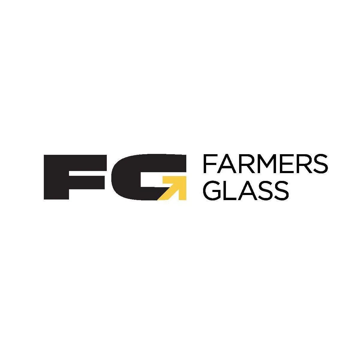

In every logo, there’s a story waiting to be told, and for Farmers Glass, the goal was clear: to reflect the business’s precision and quality in a single, memorable symbol. When designing this logo, I wanted to weave in elements that represented the craftsmanship and integrity Farmers Glass brings to every project.
The Inspiration Behind the Design
Farmers Glass specializes in high-quality glasswork, a skill that requires exacting precision and a careful touch. To convey this visually, I chose to incorporate an arrow into the “G” of “Glass.” Arrows have historically symbolized direction, accuracy, and a sense of purpose—all qualities that align with the values of Farmers Glass.
Design Elements: More Than Meets the Eye
The arrow integration within the “G” serves both form and function. It’s subtle enough not to distract from the readability of the logo but stands out upon closer inspection, making it memorable and unique. This fusion of elements showcases the careful craftsmanship in the same way Farmers Glass approaches its work.
A Logo that Grows with the Brand
A strong logo should be timeless, and as Farmers Glass grows, this logo will remain relevant and adaptable to different applications, from signage to digital branding. It’s versatile yet specific, with a distinct personality that resonates with their audience.
Bringing It All Together
Designing for Farmers Glass has been a reminder of the impact that thoughtful design choices can have on brand perception. I’m thrilled to have created a logo that truly captures the precision and integrity of the Farmers Glass brand.
Interested in more design stories or looking for your own custom logo? Check out more of my work at Hazzard County Design Studio and let’s bring your brand vision to life!
The Value of Logo Design
In today's fast-paced business environment, it's easy to think of logos and branding as merely decorative—something that's nice to have but not essential. However, as an experienced brand designer, I’ve learned that logo and brand design are far more than just a “nice touch.” They are strategic tools that can significantly impact a business's success.
The Face of Your Business: First Impressions Matter
A logo is more than just a design—it’s the face of your business. Often, it’s the first interaction a potential customer will have with your brand. This initial encounter needs to communicate the essence of your company in an instant. A well-designed logo serves as a visual handshake, a quick but memorable introduction that tells people what you’re about and why they should care.
Imagine seeing a brand for the first time. What do you notice? The logo. A poorly designed one can give the impression of carelessness or lack of professionalism. On the other hand, a thoughtfully crafted logo speaks volumes—about your business’s values, its professionalism, and its ambition.
Brand Design as a Strategic Asset
Many businesses make the mistake of seeing design as an afterthought, something that comes after the “real work” is done. But brand design is a strategic asset. Every visual element, from your logo to your packaging to your website, works together to form a cohesive message. When your branding is consistent and intentional, you create trust with your audience.
That trust is what turns one-time customers into repeat customers, and repeat customers into loyal brand advocates. People buy from brands they trust, and design plays a critical role in building that trust.
Standing Out in a Crowded Market
We live in a world where consumers are bombarded with options. The marketplace is crowded, and standing out has never been more challenging—or more essential. A strong logo and cohesive brand identity are your chance to rise above the noise.
Effective design gives your business a distinct voice and personality. It helps customers remember you, not just because of what you sell but because of how you make them feel. Whether you're competing against global giants or local competitors, your brand design is what can make your company memorable.
Emotional Connections That Last
One of the most powerful benefits of a strong logo and brand design is its ability to create emotional connections. Great design taps into feelings, memories, and values, resonating with people on a deeper level. When a logo or brand identity feels personal, customers form an emotional bond with the business.
This connection is what turns transactional relationships into long-term loyalty. Customers are more likely to buy from, recommend, and advocate for brands they feel connected to. In other words, they stop being just customers—they become your brand's community.
Projecting Credibility and Professionalism
A polished, professional logo and brand identity project credibility. They signal to customers that your business is established, reliable, and capable. In contrast, inconsistent or poorly executed design can make even the most competent company appear untrustworthy.
In business, perception is reality. If your brand design projects professionalism, your audience is more likely to view your products and services as trustworthy and high-quality. And that perception leads to conversions, sales, and growth.
Timelessness and Adaptability
One of the hallmarks of a well-designed logo is its adaptability. Your brand should be able to thrive across mediums—whether it’s on a mobile screen, a billboard, or packaging. A strong logo and identity can scale without losing its impact.
Equally important is timelessness. While trends come and go, a great logo remains relevant for years, evolving naturally with the business while retaining its core identity. A truly impactful design stands the test of time and continues to add value as the business grows.
Design Is an Investment in Success
Some businesses view branding as an unnecessary expense, but the truth is, investing in professional logo and brand design is an investment in long-term success. A strong visual identity provides a clear return on investment by enhancing visibility, reputation, and customer loyalty.
Neglecting your brand design puts your business at risk of being overlooked or misunderstood. In contrast, a company that invests in a thoughtful, strategic visual identity positions itself for growth, recognition, and long-term profitability.
A Brand Is a Promise
At its core, a brand is a promise to your customers. It’s a commitment to delivering a consistent experience, every time someone interacts with your company. Logo and brand design give that promise a voice and shape. Without strong design, your promise remains abstract and easily forgotten.
Conclusion: Design Equals Business
In the end, logo and brand design are not just about looking good. They are about building a foundation for trust, credibility, and emotional connection with your customers. They are about making your business stand out in a crowded marketplace and communicating the values that make your company unique.
Good design is good business. It’s not just an artistic endeavor—it’s a strategic tool that adds real, measurable value to your business. If you want your brand to thrive, invest in its identity. Design is not just the surface; it’s the soul of your business, made visible.
Emmie June Cake Co Logo Design
Here’s one of my favorite logo designs from the portfolio. Emmie June cake Co Logo Package
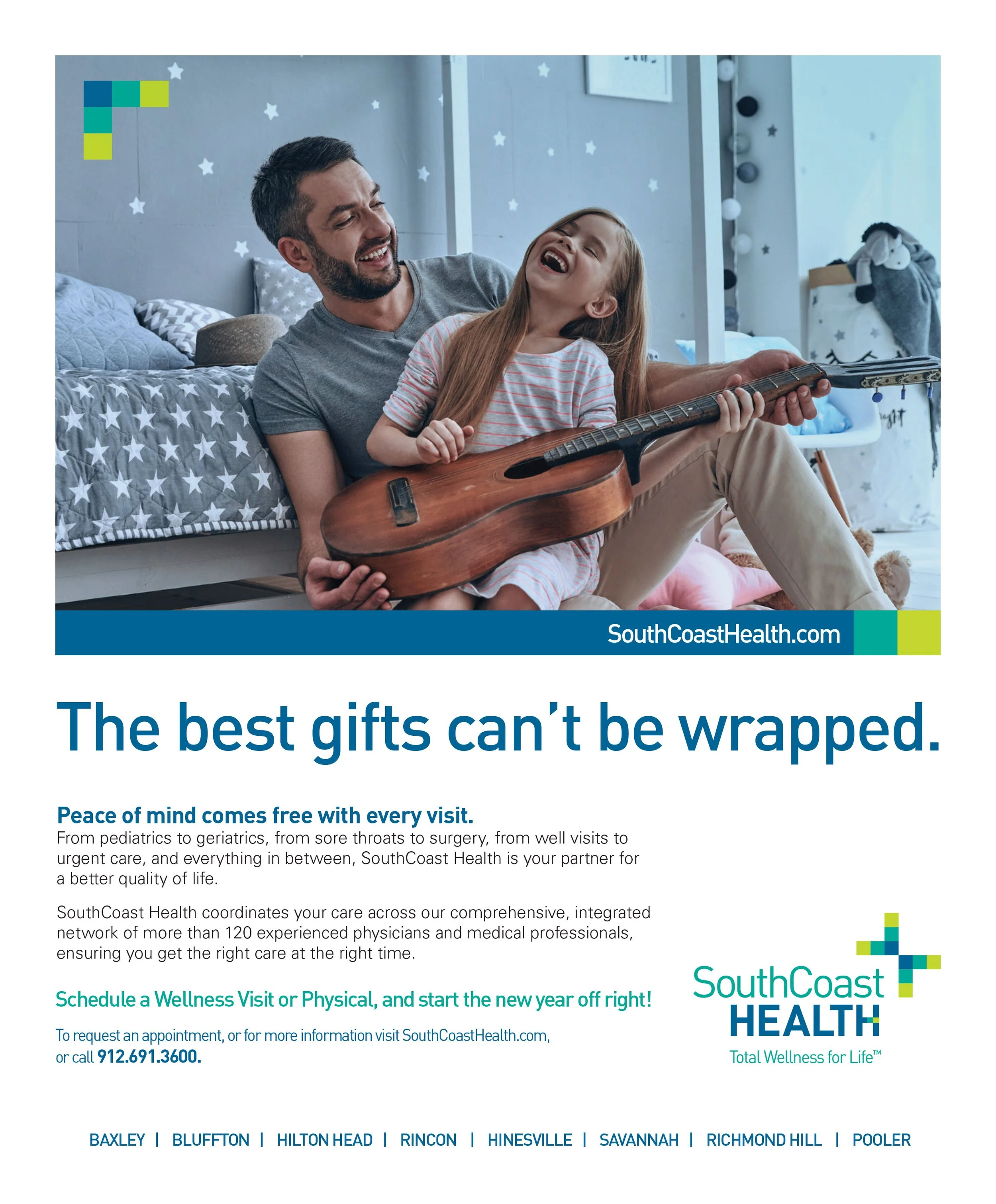
SouthCoast Health
Identity & Branding • Print Advertising • Digital Advertising
SouthCoast Health is a Savannah-based healthcare provider with 120 healthcare professionals working across more than 20 specialties and services. We developed a new identity and branding system for them. The identity system was built to include each of their specialties and service lines as well as allowing for future growth.
We also brought the brand to life across several media including print and digital ads. The print ads focused on brand awareness and the corporate brand. With the digital ads we were able to take a more targeted approach and focus on each of the specialty and service lines.
Designed while working at Lenz Marketing.


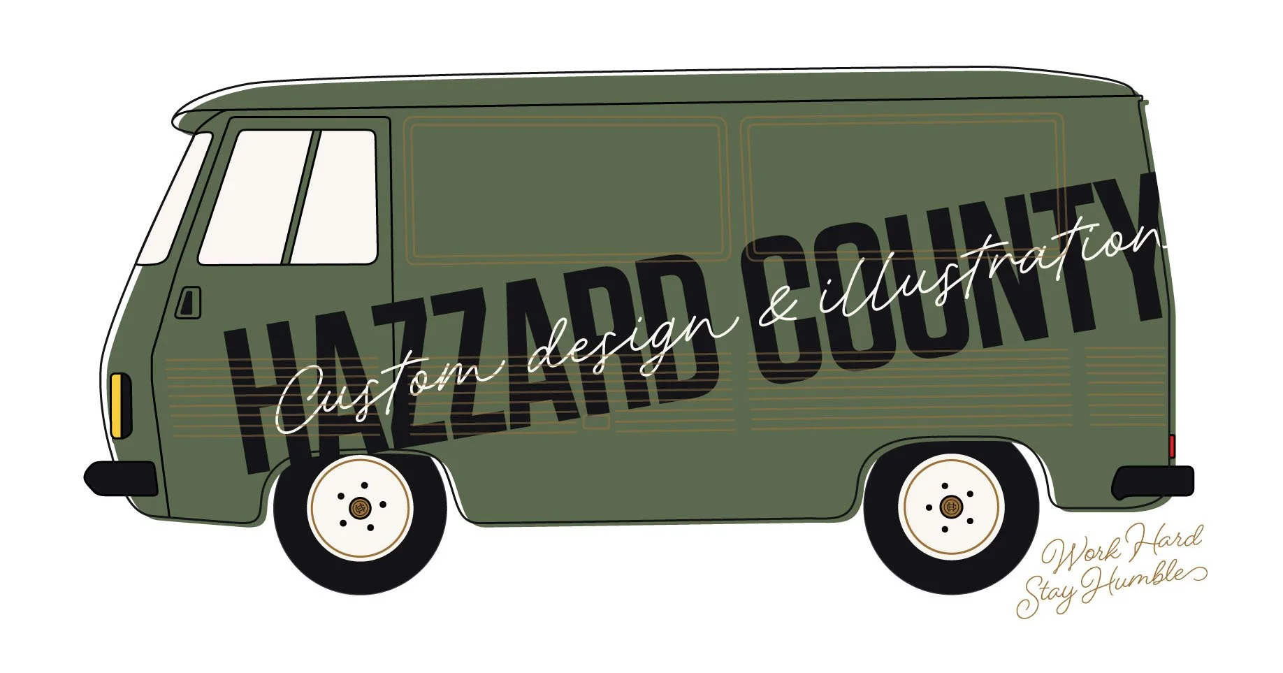
Hazzard County Delivery Van Illustration
I love how illustration allows you to create worlds that include all of your favorite things. In this case I’ve taken my passion for cars, architecture, and landscaping and blended them into a dream location.

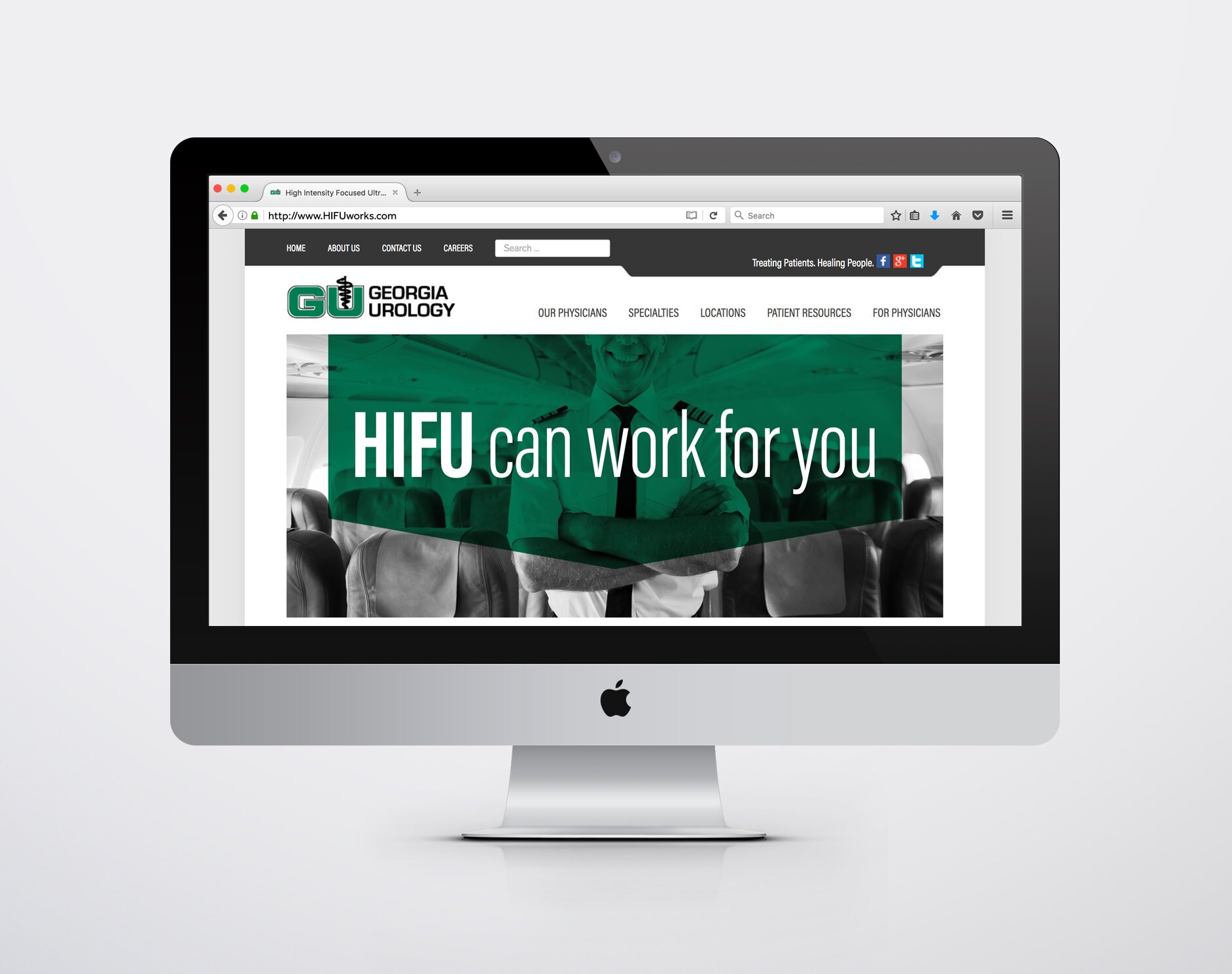
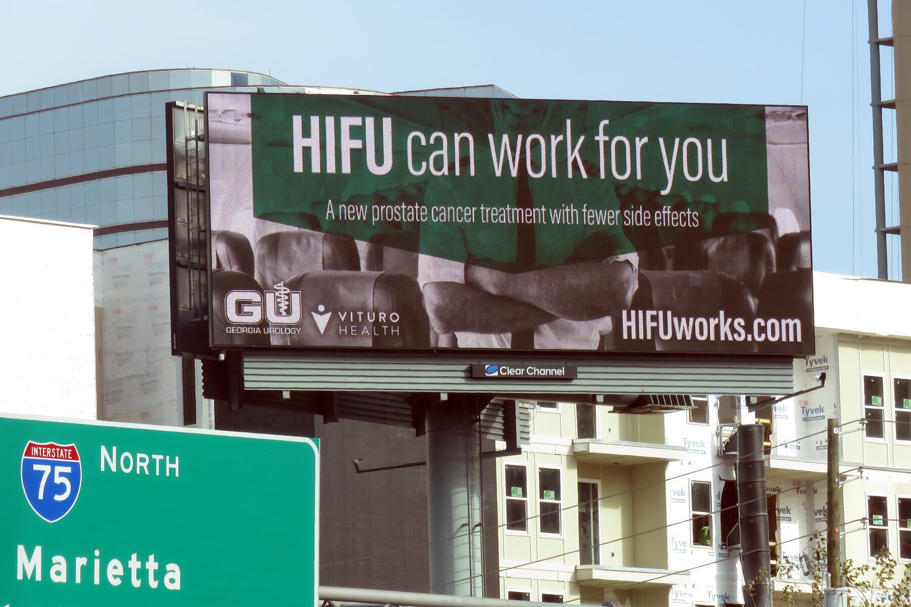
Georgia Urology
HIFU Campaign
Website • Advertising • Out of Home
Georgia Urology is the largest and oldest urology practice in the Metro Atlanta market. They employ 50 Urologists with 30 offices all across Georgia. They address the urologic needs of men, women, and children.
We developed a campaign for their yearly marketing and advertising needs. They approached us to develop a strategy around a specialty program they offer that focuses on a procedure specific to prostate cancer(High-intensity focused ultrasound - HIFU). This was a minimally invasive procedure that was targeted to audiences who could pay out of pocket and needed minimal downtime.
Since this was going to be running in the Atlanta market, downtown, and near the airport, we focused on pilots - who were determined to be prime candidates for the procedure. The campaign utilized print advertising, outdoor, and radio which all pushed to a microsite that focused on patient conversion. The campaign ran for 3 months and increased conversions by 60%. Designed while working at Lenz Marketing.

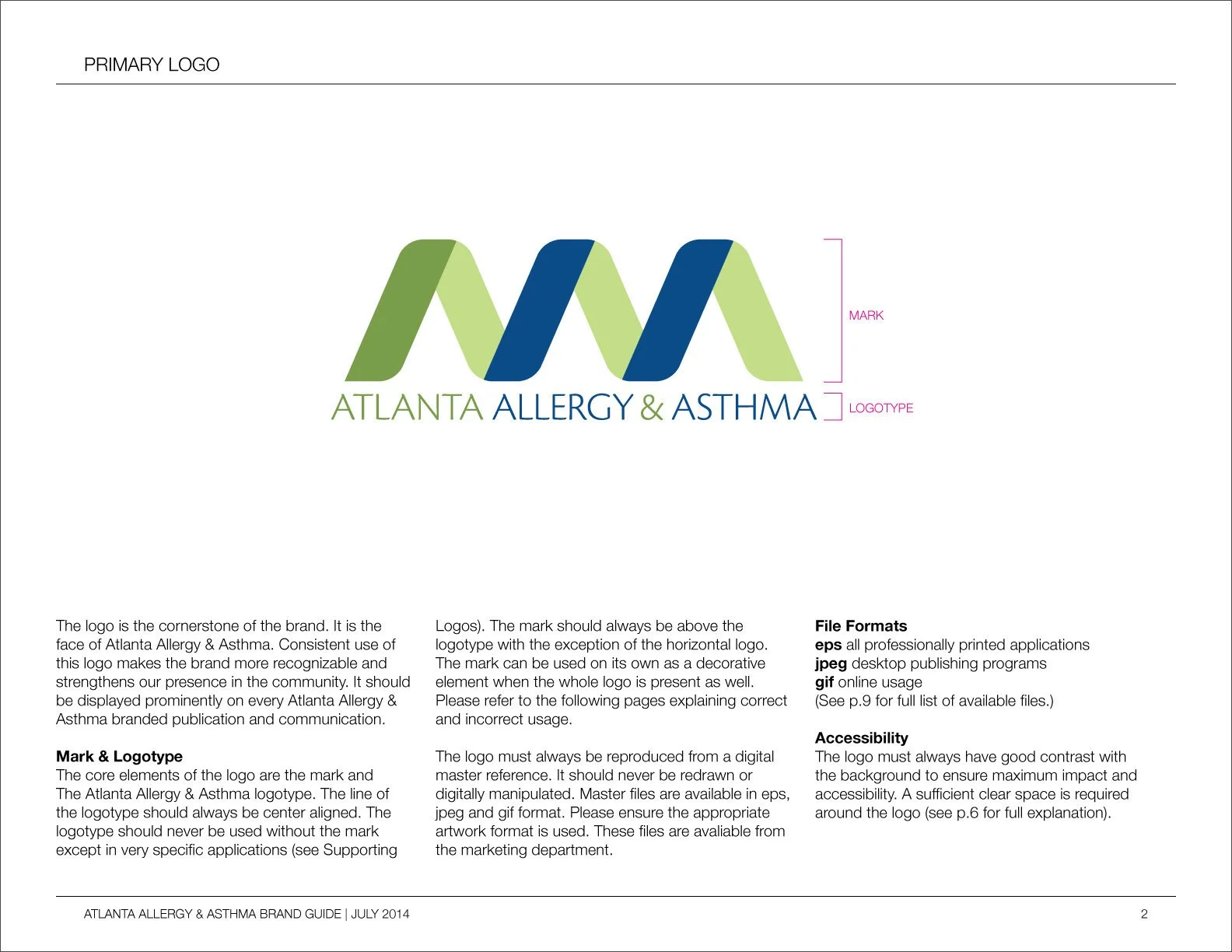
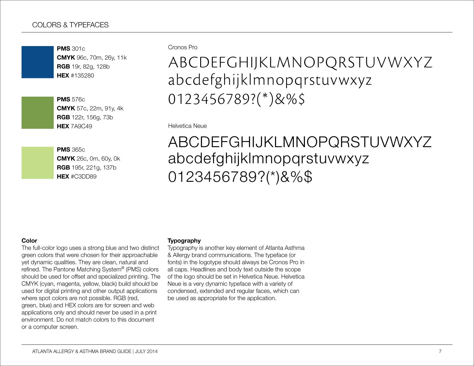
Atlanta Allergy & Asthma
Identity & Branding
Atlanta Allergy & Asthma is the largest allergy group in Atlanta, with 17 locations. For more than 45 years, they have been the experts in the diagnosis and treatment of allergies, asthma, food allergies, sinusitis, and immunologic diseases. They are the official provider of the pollen count to The Weather Channel.
The client was interested in updating their identity and branding. They felt it did not represent their expertise in their field and did not look polished. They did however like the color palette and wanted to maintain that in the new brand.
We developed a new brand and identity that was more reflective of their level of experience and expertise. The alliteration in their name lent itself to the creation of a mark that is suggestive of a strand of DNA. This symbol for the building block of life and all matter worked well to represent the field they work in. We also developed a brand guide to help their marketing team implement the new brand as it was rolled out into the market. Designed while working at Lenz Marketing.


PlumbWorks Academy
Identity & Branding • Animation & Video Planning, Capture, & Editing • Web Design
PlumbWorks Academy is a plumbing education initiative launched by the PlumbWorks brand. PlumbWorks is a plumbing company serving the Metro Atlanta area. They primarily service residential plumbing needs.
The goal of the PlumbWorks Academy was two-fold. Empower homeowners to tackle simple plumbing jobs themselves, and recruit new plumbers to start a career in plumbing. They had identified many simple plumbing tasks that they received a high volume of calls for but were not profitable for the company. They also had noticed a trend of lack of new recruits in the plumbing field.
Our solution was to create an education initiative sponsored by the company. We developed an identity system and branding for the academy based on Plumbworks’ corporate brand. Created a series of educational videos positioning their plumbing staff as the plumbing experts. As well as executed a social and content campaign. All of these efforts pushed to a microsite that acted as a funnel to empower homeowners, generate sales, and recruit plumbers.
We partnered with kaleidary.com for the introduction animation and provided creative direction to a video vendor to produce the how-to videos for the series. A microsite was designed to host the content, act as a conversion tool, and was also used as a recruitment tool. Designed while working at Lenz Marketing.


Powerade
Vehicle Design • Experiential Branding
Powerade was the official sponsor of the NHRA Drag Racing Series. As a member of the Powerade Team we created an experiental marketing experience that followed the NHRA Drag racing series from event to event. The design of this truck was used as a backdrop during the events and the truck was used to haul around the on site activation.


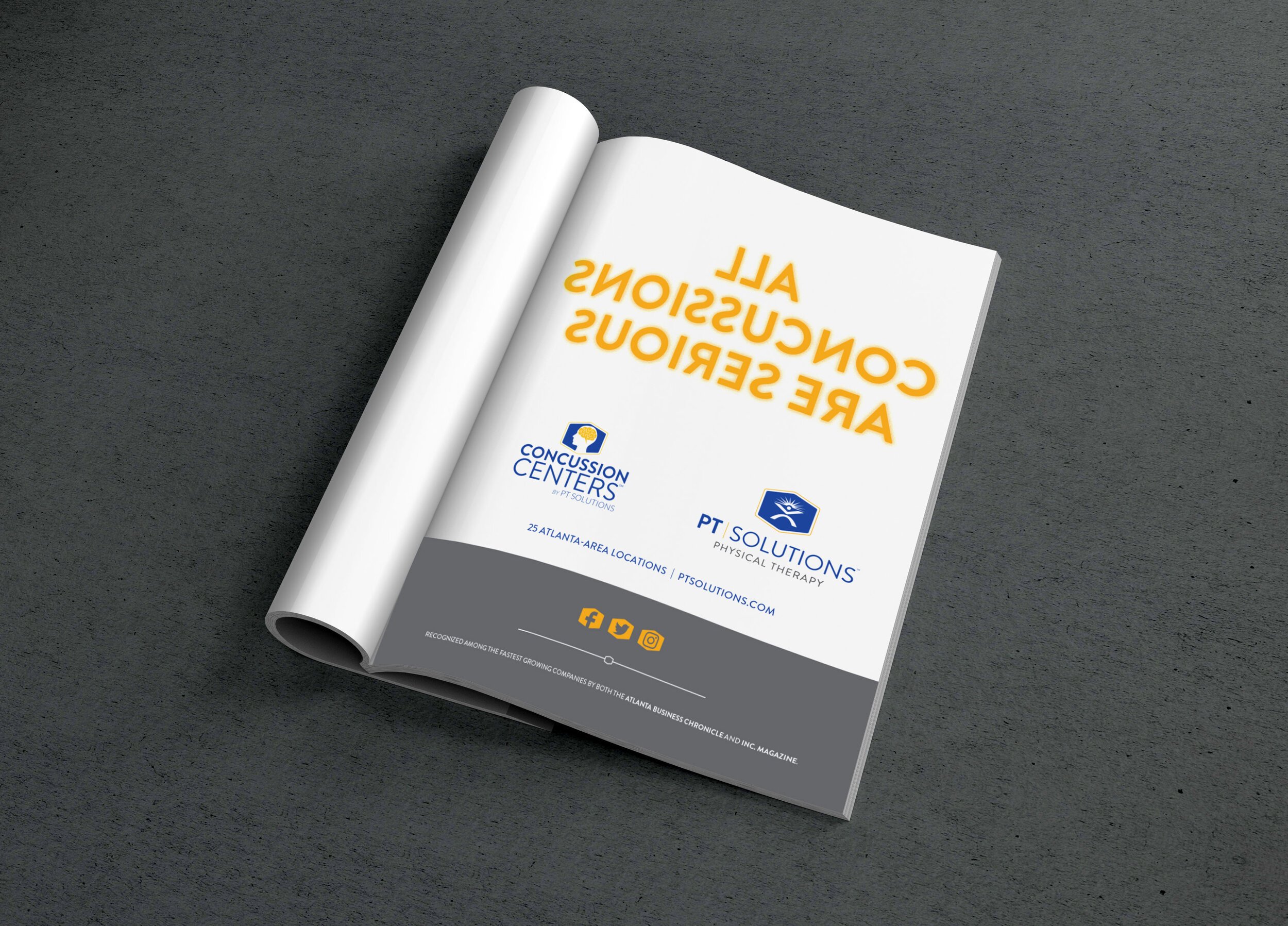
PT Solutions
Branding • Responsive Web Design • Advertising
PT Solutions is a physical therapy organization with locations across the country that focuses on athletes and sports based treatments. They are on a fast growth trajectory and their website was not serving their needs. By employing UX/UI best practices we redesigned the site to focus on ease of use for the client and the way they engaged with the site. We also designed print ads as part of a larger marketing strategy to build brand awareness and roll out a Concussion Center. Designed while working at Lenz Marketing.

Special Delivery - Custom Design and Illustration

There are a lot of talented designers and illustrators out there. And while talent is important there are a lot of other things to consider when you’re looking for a creative partner. Delivering on time and meeting client goals are equally important if not more so. Being a reliable partner and using a transparent process is what sets Hazzard County apart. Reach out today to learn more about what our creative work ethic can deliver for your brand. Work Hard. Stay Humble.
The ROI of Good Design
The long-term benefits of investing in your organization’s brand.
Showing the dollar value of good design practices can be challenging. Design is a craft that takes time and follows rigorous processes. Designers can work more efficiently when all the necessary resources are readily available. The results of this are a smoother process and improved execution. Creating efficiencies within this process can translate to faster design execution, additional design options, and improved employee satisfaction.
Conversely, when a designer doesn't have what they need or has to spend additional time searching for or recreating assets the process can break down with missed deadlines and inconsistencies in brand experience. Let's explore some key aspects of the ROI of good design:
Enhanced User Experience: Good design prioritizes the needs and preferences of users, resulting in a seamless and intuitive user experience. When users find it easy to navigate, understand, and interact with your digital product, they are more likely to engage with it, stay longer, and convert to loyal customers. Positive user experiences lead to increased customer satisfaction, repeat business, and positive word-of-mouth referrals.
Increased Conversion Rates: A well-designed digital product can significantly impact conversion rates. Clear call-to-actions, intuitive user flows, and visually appealing design elements can guide users toward desired actions, such as making a purchase, signing up for a service, or submitting a form. By optimizing the conversion funnel through good design, businesses can maximize their ROI by generating more leads, sales, and revenue.
Competitive Advantage: In today's crowded digital landscape, standing out from the competition is crucial. An aesthetically pleasing design that seamlessly integrates with its functionality can help distinguish your product from its competitors. When users have a positive impression of your brand and find your product visually appealing and easy to use, they are more likely to choose it over alternatives. This competitive advantage can lead to increased market share, customer loyalty, and long-term business growth.
Brand Perception and Reputation: A brand's professionalism and attention to detail can be showcased through good design. It communicates a sense of trust, reliability, and quality to users. When users perceive your product as visually appealing and well-designed, it enhances their perception of your brand. This positive brand perception contributes to a strong reputation, increased customer loyalty, and a competitive edge in the market.
Flexibility and Adaptability: Good design allows for flexibility and adaptability in the face of evolving user needs and technological advancements. Design debt can hinder a product's ability to adapt and scale. By investing in good design practices, businesses can future-proof their digital products, making them easier to update, expand, and integrate with new technologies. This adaptability leads to cost savings and improved agility in responding to market demands.
Good design in digital product design, build, and maintenance brings numerous tangible and intangible benefits. By considering the long-term ROI of good design, businesses can make informed decisions by prioritizing design as a driver of their success in the digital realm.