Your Custom Text Here
Amplify Music Festival


Amplify Music Festival — Identity & Branding • Environmental Design • Advertising
Role: Creative Director (Lenz Marketing)
Client: Amplify Music Festival
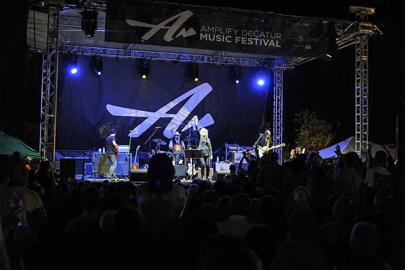
Amplify is a non-profit organization that harnesses the power of music and community to raise funds for local causes in the metro Atlanta area. Its flagship event, a three-day music festival, takes place across multiple venues in Decatur, GA—including an open-air stage on the city’s square—and has grown into a beloved tradition for both residents and visitors.
To capture the spirit of the event and its mission, we developed a dynamic identity system, poster art, website, digital and traditional advertising, and environmental graphics. The brand identity was designed to reflect both the meaning behind the organization’s name—amplifying the impact of local nonprofits—and the energy of the live music performances themselves. Each year, the festival’s visual language evolves, with new poster art that not only celebrates the featured musical talent but also serves as the foundation for the broader advertising campaign, website design, and on-site graphics.
Environmental design played a crucial role in creating a cohesive experience for attendees. Signage, stage banners, and venue graphics were designed to reinforce the brand identity, guide festival-goers between locations, and bring a sense of vibrancy to the entire event footprint.
The results speak for themselves: attendance, performance slots, and participating venues have grown year over year. Since its inception in 2011, Amplify has raised more than $575,000 for community-based nonprofits, directly benefiting organizations that make a tangible difference in the lives of local residents.
Farmers Glass Logo Design


In every logo, there’s a story waiting to be told, and for Farmers Glass, the goal was clear: to reflect the business’s precision and quality in a single, memorable symbol. When designing this logo, I wanted to weave in elements that represented the craftsmanship and integrity Farmers Glass brings to every project.
The Inspiration Behind the Design
Farmers Glass specializes in high-quality glasswork, a skill that requires exacting precision and a careful touch. To convey this visually, I chose to incorporate an arrow into the “G” of “Glass.” Arrows have historically symbolized direction, accuracy, and a sense of purpose—all qualities that align with the values of Farmers Glass.
Design Elements: More Than Meets the Eye
The arrow integration within the “G” serves both form and function. It’s subtle enough not to distract from the readability of the logo but stands out upon closer inspection, making it memorable and unique. This fusion of elements showcases the careful craftsmanship in the same way Farmers Glass approaches its work.
A Logo that Grows with the Brand
A strong logo should be timeless, and as Farmers Glass grows, this logo will remain relevant and adaptable to different applications, from signage to digital branding. It’s versatile yet specific, with a distinct personality that resonates with their audience.
Bringing It All Together
Designing for Farmers Glass has been a reminder of the impact that thoughtful design choices can have on brand perception. I’m thrilled to have created a logo that truly captures the precision and integrity of the Farmers Glass brand.
Interested in more design stories or looking for your own custom logo? Check out more of my work at Hazzard County Design Studio and let’s bring your brand vision to life!
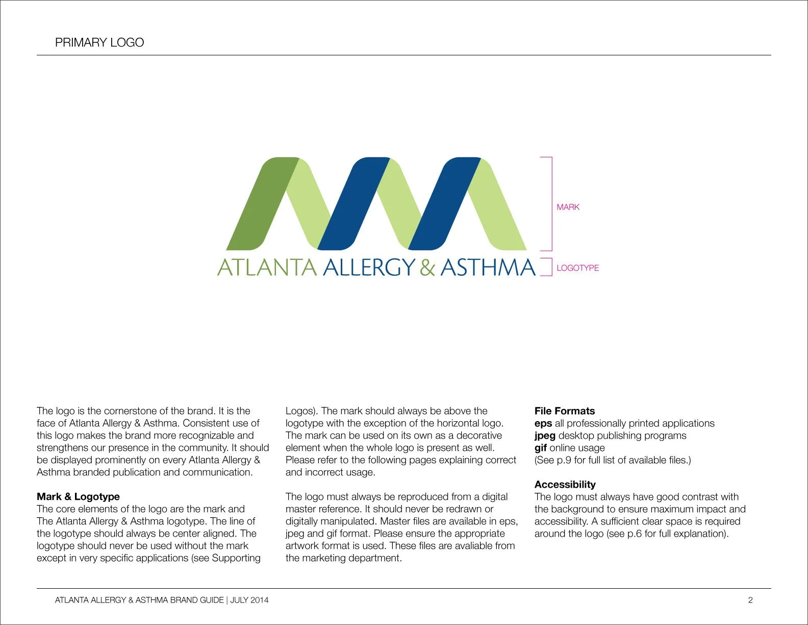
Atlanta Allergy & Asthma
Identity & Branding
Atlanta Allergy & Asthma is the largest allergy group in Atlanta, with 17 locations. For more than 45 years, they have been the experts in the diagnosis and treatment of allergies, asthma, food allergies, sinusitis, and immunologic diseases. They are the official provider of the pollen count to The Weather Channel.
The client was interested in updating their identity and branding. They felt it did not represent their expertise in their field and did not look polished. They did however like the color palette and wanted to maintain that in the new brand.
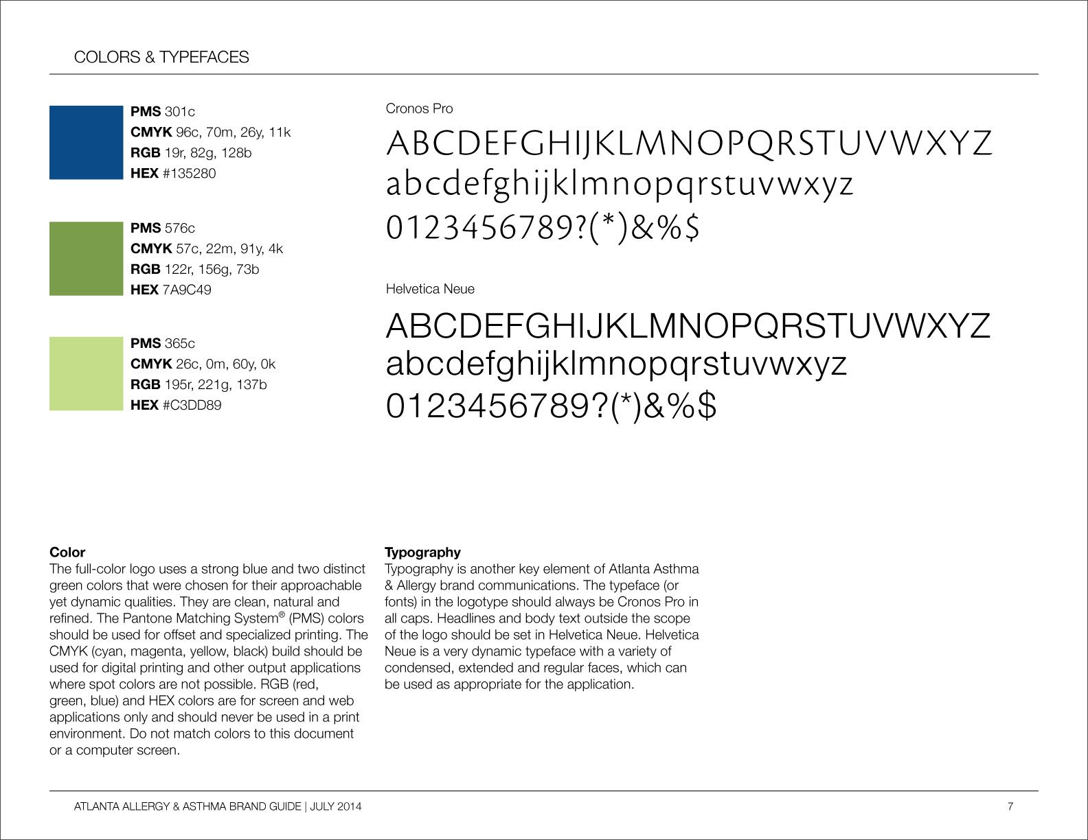
We developed a new brand and identity that was more reflective of their level of experience and expertise. The alliteration in their name lent itself to the creation of a mark that is suggestive of a strand of DNA. This symbol for the building block of life and all matter worked well to represent the field they work in. We also developed a brand guide to help their marketing team implement the new brand as it was rolled out into the market. Designed while working at Lenz Marketing.


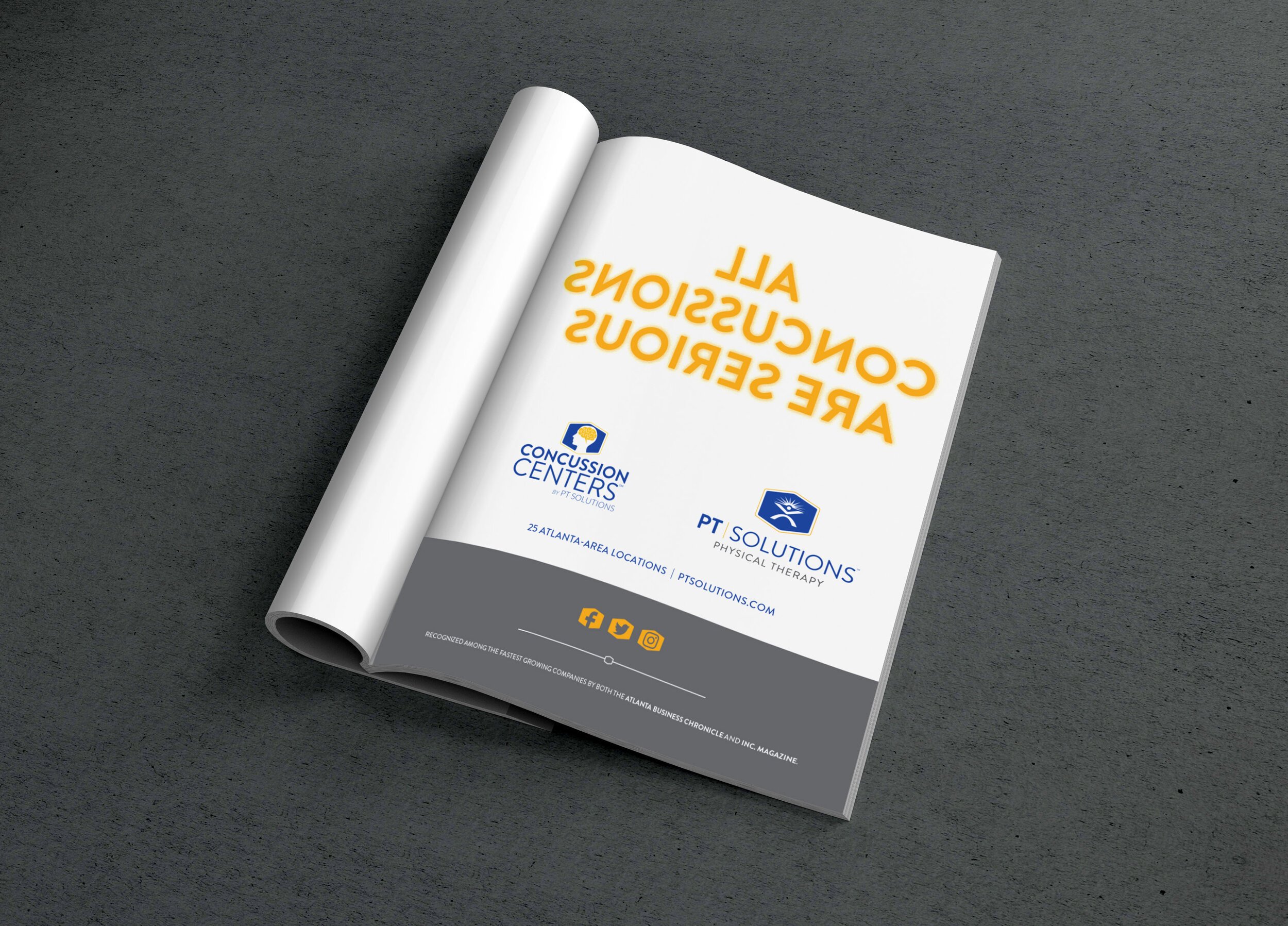
PT Solutions
Branding • Responsive Web Design • Advertising
PT Solutions is a physical therapy organization with locations across the country that focuses on athletes and sports based treatments. They are on a fast growth trajectory and their website was not serving their needs. By employing UX/UI best practices we redesigned the site to focus on ease of use for the client and the way they engaged with the site. We also designed print ads as part of a larger marketing strategy to build brand awareness and roll out a Concussion Center. Designed while working at Lenz Marketing.

Superyacht Ambition Logo Design
Need to brand a superyacht? We can help. I wanted to pull back the curtain a little and show some of our process for creating a logo design. You get multiple options to choose from based on a collaborative approach that includes your input. Once you’re happy with the initial choices you provide feed back on your favorite designs and we make edits to custom tailor the designs to your liking and needs. We provide guidance through out the process to make sure you end up with the highest quality finished product.
Internal Branding Project - Made in the USA
There’s something about seeing a Made in the USA badge on a product that makes you stop and think. It gives you a certain sense of pride and in some ways, it feels like a rallying cry.
Unfortunately, a lot of them are poorly designed or look dated.
Apple takes pride in the fact that its products are Designed in California. And while I do love the Hazzard County area, I wanted to try to create a sense of unity and togetherness within the designs that seem to be needed now more than ever within this country.
You can count on Hazzard County to keep your designs Made in the USA.


