Your Custom Text Here
Amplify Music Festival


Amplify Music Festival — Identity & Branding • Environmental Design • Advertising
Role: Creative Director (Lenz Marketing)
Client: Amplify Music Festival
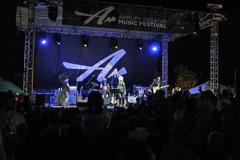
Amplify is a non-profit organization that harnesses the power of music and community to raise funds for local causes in the metro Atlanta area. Its flagship event, a three-day music festival, takes place across multiple venues in Decatur, GA—including an open-air stage on the city’s square—and has grown into a beloved tradition for both residents and visitors.
To capture the spirit of the event and its mission, we developed a dynamic identity system, poster art, website, digital and traditional advertising, and environmental graphics. The brand identity was designed to reflect both the meaning behind the organization’s name—amplifying the impact of local nonprofits—and the energy of the live music performances themselves. Each year, the festival’s visual language evolves, with new poster art that not only celebrates the featured musical talent but also serves as the foundation for the broader advertising campaign, website design, and on-site graphics.
Environmental design played a crucial role in creating a cohesive experience for attendees. Signage, stage banners, and venue graphics were designed to reinforce the brand identity, guide festival-goers between locations, and bring a sense of vibrancy to the entire event footprint.
The results speak for themselves: attendance, performance slots, and participating venues have grown year over year. Since its inception in 2011, Amplify has raised more than $575,000 for community-based nonprofits, directly benefiting organizations that make a tangible difference in the lives of local residents.
American Oncology Network

American Oncology Network — Responsive Web Redesign
Role: Creative Director Lenz Marketing)
Client: American Oncology Network (AON)
Platform: Responsive Web
Scope: Website redesign, audience strategy, UX/UI design, responsive implementation
The Challenge
American Oncology Network is a nationwide alliance supporting community oncology practices across the United States. Their website needed to serve two core audiences with very different needs:
Physicians and practice leaders evaluating partnership opportunities and professional resources
Patients and families seeking care information, trust, and support
The existing experience did not clearly distinguish between those audiences, creating friction in navigation and making it harder for users to quickly find relevant content.
The opportunity was to create a more intuitive, modern digital experience that clarified pathways, strengthened the brand, and performed seamlessly across devices.
My Role
I led the redesign effort from strategy through execution, translating business goals and audience needs into a clearer digital experience.
Key contributions included:
Defining audience needs and content priorities
Structuring user flows for physicians and patients
Leading visual design direction and responsive layouts
Partnering with developers to bring the experience to life across breakpoints
Ensuring consistency with the broader brand and marketing ecosystem
The Solution
1. Audience-Focused Information Architecture
Reorganized site structure and navigation to better support the priorities of each audience group.
Clearer entry points for physicians and patients
More relevant content surfaced earlier in the journey
Reduced friction in key navigation paths
Result: A more intuitive experience tailored to user intent.
2. Responsive Experience Across Devices
Designed a fully responsive website optimized for desktop, laptop, tablet, and mobile.
Flexible layouts across screen sizes
Improved readability and usability
Consistent experience regardless of device
Result: Better accessibility and engagement for users wherever they accessed the site.
3. Modernized Brand Expression
Refreshed the visual experience to better reflect AON’s professionalism, credibility, and patient-centered mission.
Stronger visual hierarchy
Cleaner presentation of complex information
More polished and trustworthy digital presence
Result: A digital experience aligned with the organization’s scale and reputation.
Conclusion
By differentiating user journeys for oncologists and patients, the new AON website delivered clarity, speed, and trust for two distinct audiences. The responsive redesign not only elevated the brand experience but also supported AON’s rapid growth and national expansion.
FedEx | ShopRunner


ShopRunner (FedEx) — Scaling a Unified Design System Across B2C & B2B Platforms
Role: Director of UX/UI (Bottle Rocket)
Client: FedEx – ShopRunner
Platforms: Desktop, Mobile Web, iOS, Android, Merchant Dashboard (B2B)
Scope: Cross-platform product expansion, design system creation, and governance
Strategic Challenge
ShopRunner — an Amazon Prime–style membership program acquired by FedEx in 2020 — offers free two-day shipping, free returns, and member-only discounts through its network of retail partners.
The company had an existing desktop and mobile web presence but wanted to:
Expand into native iOS and Android apps for consumers.
Develop a merchant-facing dashboard (B2B) for managing sales, returns, and customer engagement.
To maintain brand and experience consistency across multiple teams and platforms, we needed a scalable design system that could align diverse product groups while supporting rapid development.
My Role & Leadership
Partnered with product leads across consumer and merchant experiences to identify shared needs and technical constraints.
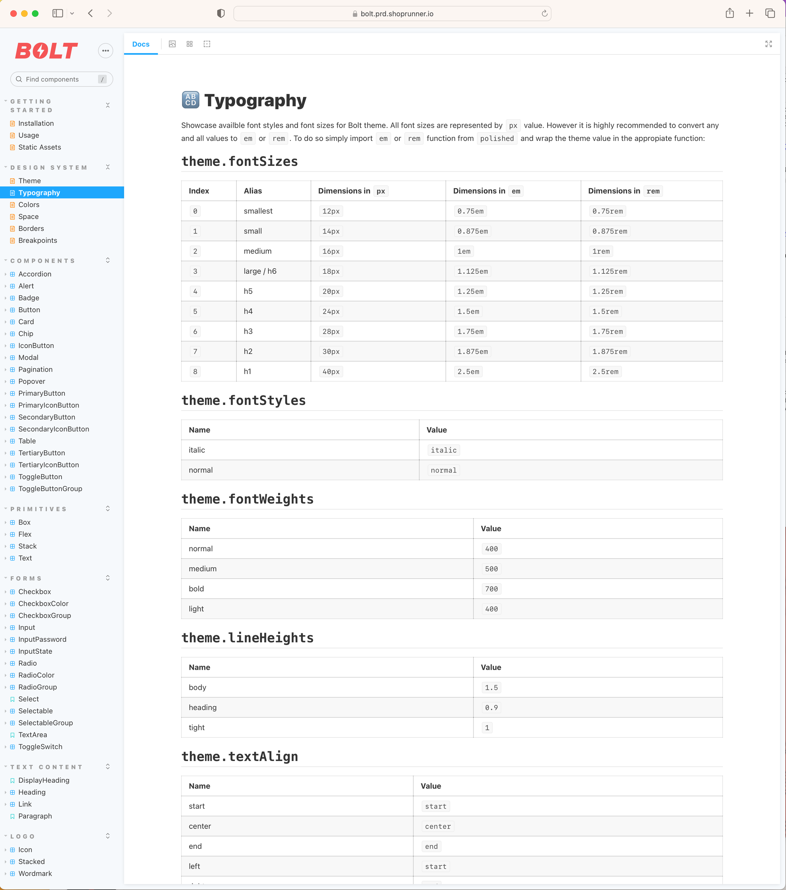
Directed the creation of “Bolt”, a cross-platform design system that provided both a visual identity framework and reusable coded components.
Established governance processes to manage component creation, version control, and cross-team adoption.
Led design-development alignment by ensuring a 1:1 relationship between the Figma design library and Storybook code library.
Key Initiatives & Outcomes
1. Bolt Design System Development
Created a comprehensive Figma library covering typography, color, iconography, spacing, and responsive component patterns.
Partnered with development to build a matching Storybook code library, ensuring visual and functional parity across all products.
Standardized UI patterns to streamline workflows and reduce redundant design effort.
Impact:
Enabled product teams to design and build faster, with fewer inconsistencies.
Reduced QA feedback cycles by ensuring components were vetted in both design and code before release.
2. Cross-Team Alignment & Governance
Brought together B2C and B2B product teams in recurring governance meetings to review, approve, and prioritize new components.
Created shared documentation and usage guidelines to support onboarding and future expansion.
Impact:
Improved transparency between product teams, eliminating duplicate work.
Increased cross-platform consistency, strengthening the ShopRunner brand experience.
3. Product Launches Powered by Bolt
Launched updated desktop and mobile web experiences with modernized UI.
Released new iOS and Android apps for consumers.
Developed a merchant dashboard (B2B) with consistent UI patterns, improving usability for partners.
Impact:
Delivered a cohesive visual and interaction language across all platforms.
Improved efficiency for both design and development teams, enabling faster feature rollouts.
Conclusion
The Bolt Design System unified ShopRunner’s growing ecosystem under a single source of truth for both design and code. By embedding governance, fostering cross-team collaboration, and ensuring parity between Figma and Storybook, we created a scalable foundation for future product growth — while delivering a consistent, high-quality experience to both consumers and merchants.
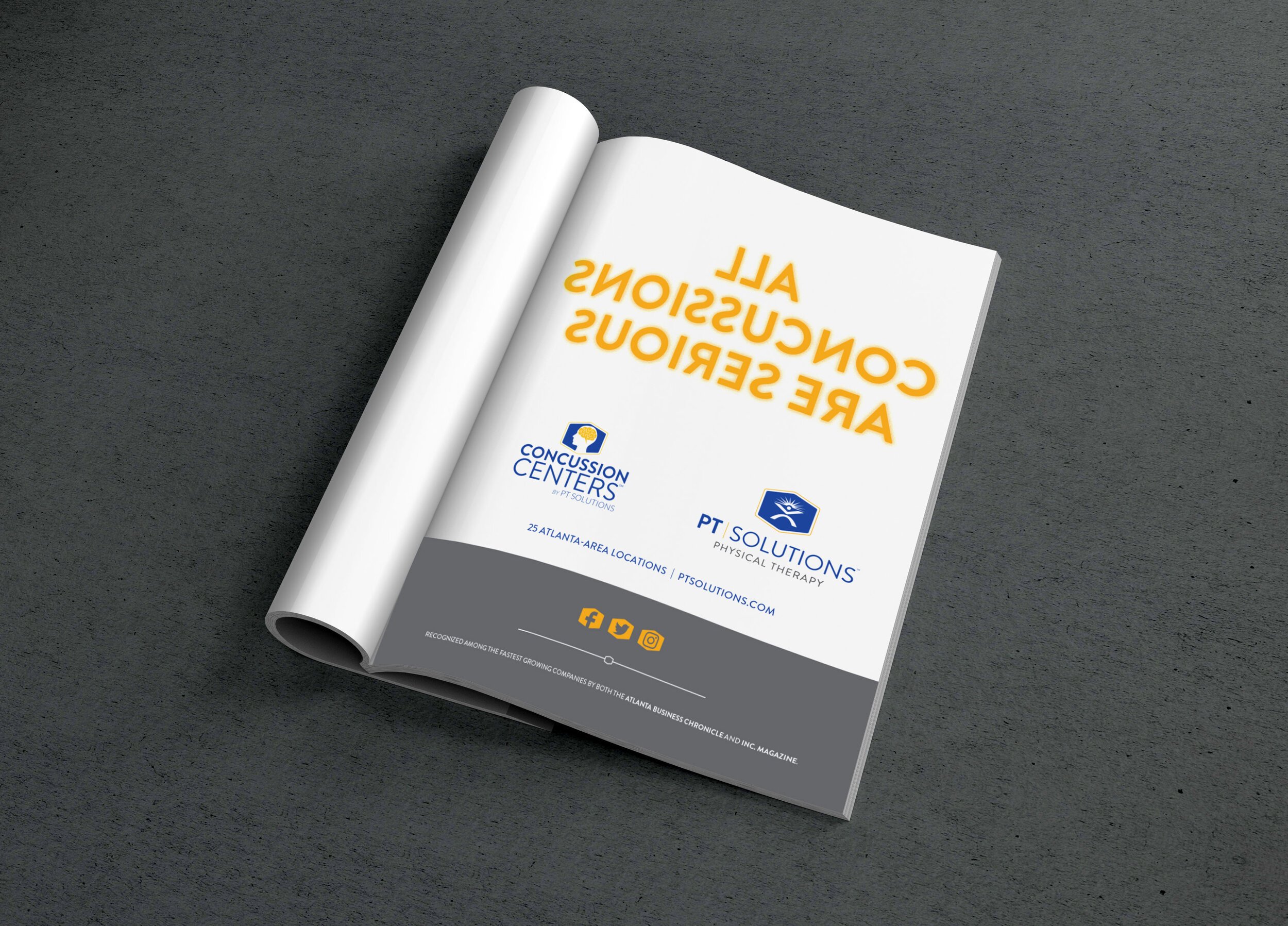
PT Solutions
Branding • Responsive Web Design • Advertising
PT Solutions is a physical therapy organization with locations across the country that focuses on athletes and sports based treatments. They are on a fast growth trajectory and their website was not serving their needs. By employing UX/UI best practices we redesigned the site to focus on ease of use for the client and the way they engaged with the site. We also designed print ads as part of a larger marketing strategy to build brand awareness and roll out a Concussion Center. Designed while working at Lenz Marketing.